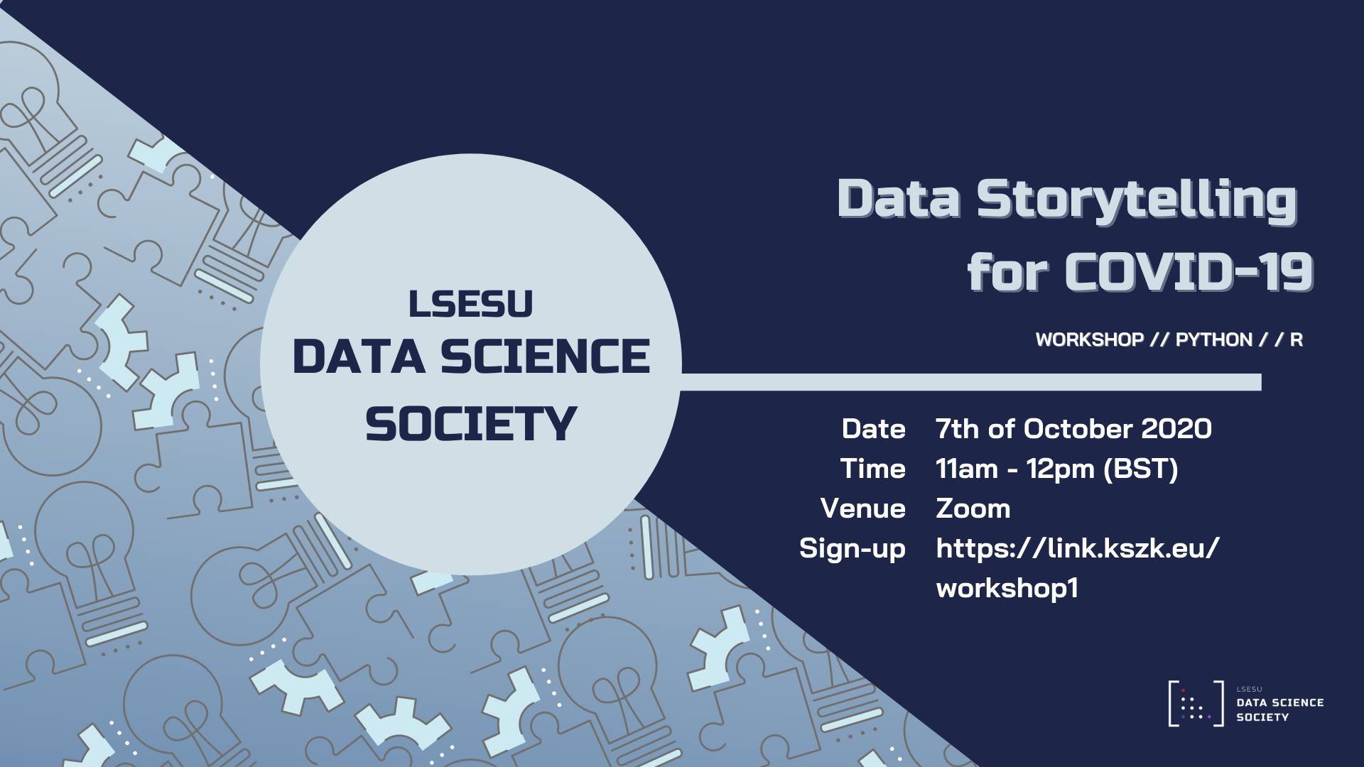
LSESU Data Science Society Workshop: Data Storytelling for COVID-19

Facebook Event Link: https://www.facebook.com/events/966562630487972
In our first workshop, we introduced the potential of using programming to visualise data, using COVID-19 data as an example. We show examples in Python, R, depending on your preference.
We explore:
Python
- Using Matplotlib and Plotly to produce plots - line plots, scatterplots
- How to visualise text - bar plots, wordcloud
- Using Bokeh to produce heatmaps
R
- Using
plot(), ggplot to produce plots - line plots, scatterplots - How to visualise text - bar plots, wordcloud
- Producing heatmaps
Further Learning
Python Data Science Handbook, Vanderplas, J.: https://jakevdp.github.io/PythonDataScienceHandbook/
R for Data Science, Wickham, H. : https://r4ds.had.co.nz/
07/10/2020